LOOMA EDUCATION
Looma Education, a nonprofit, aims to provide modern digital learning experiences for students in Nepal. However, the platform faced usability and accessibility challenges, making it difficult for students and teachers to navigate resources effectively. As a UI/UX Design Intern, my goal was to enhance usability, accessibility, and engagement by identifying key improvements that would better serve diverse learners, including those with disabilities.
Through user research and interviews, I gathered insights from teachers, students, and accessibility experts. Based on these findings, I developed a comprehensive UI/UX report outlining recommendations for navigation, content layout, and accessibility enhancements. My contributions included refining information architecture, improving user flows, and suggesting design updates aligned with Nepal’s government guidelines.
By delivering a data-driven roadmap for the platform’s redesign, my work helped improve the learning experience for 7,000 students across 70 schools in Nepal. The recommendations provided a foundation for future platform improvements, making the digital learning environment more intuitive, inclusive, and engaging for students and educators.
Role:
UI/UX Design Intern
Tools:
Figma, Adobe Illustrator, Adobe Photoshop
Skills:
UI/UX Design, User Research
About Looma Education
Looma Education is a nonprofit organization based in Menlo Park that provides digital learning solutions for schools K-12 in Nepal. Their platform offers an interactive learning experience through a hardware-software combination designed to improve accessibility and engagement in classrooms. Looma aims to make education more inclusive, especially for students with limited resources.
Figma Breakdown
I created a Figma breakdown of the Looma website to systematically organize its pages, analyze its layout, and gain a deeper understanding of each component’s functionality.
Looma Wand Testing
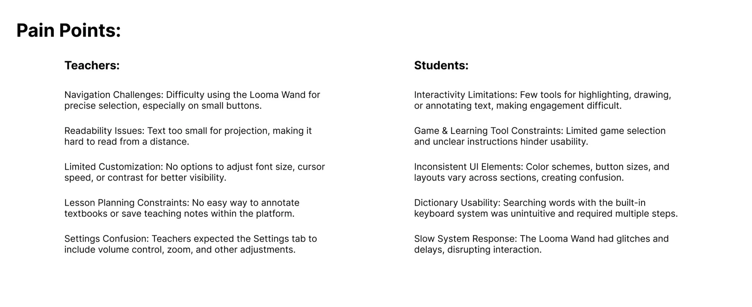
I conducted Looma Wand and projector testing to evaluate the platform’s usability in real classroom settings, identifying challenges in navigation, readability, and interaction. The wand, while central to the platform’s functionality, was hard to handle due to its size, high sensitivity, and lack of precision, making it difficult for teachers and students to navigate effectively. This testing informed design improvements, such as increasing text size for readability, enhancing button visibility for easier selection, and optimizing UI elements for better projection clarity, ensuring a more seamless and accessible classroom experience.
Interviews
I conducted interviews with teachers, students, and the Nepal Looma team to understand user needs, classroom challenges, and usability pain points.
Accessibility
I conducted interviews with teachers, students, and the Nepal Looma team to understand user needs, classroom challenges, and usability pain points.
Style Guide
I formalized Looma Education’s previously implicit style guide, improving branding consistency and accessibility across the platform. While Comic Sans is an uncommon choice in professional design, user research revealed its legibility benefits for young students and teachers, making it a practical choice for early readers. This reinforced the importance of prioritizing user needs over design conventions to create a more effective and inclusive learning experience.


